Ingredients
- 2 pounds of Ground chicken thighs- I prefer using chicken thighs for lumpia shanghai as it is more juicy and flavorful than chicken breast. There are different types of lumpia, but the most common one uses ground pork. You can even use ground beef or a combination.
- 1 grated large Carrot- (1 cup) Fresh carrots are best for texture and flavor, but pre-shredded carrots will work too.
- 1 grated Onion- Freshly diced onion for the best flavor! I use white onion, but you can use red.
- 2 Eggs- Add a beaten egg to the lumpia filling for a richer flavor and to help bind the ingredients together.
- 2 tbsp Oyster sauce- For a more umami flavor, use oyster sauce. You can even put in a little fish sauce or Knorr liquid seasoning.
- 1 tbsp Soy sauce- Use low-sodium soy sauce for a less salty taste, but you can always use a regular one.
- 2 tsp Cornstarch- Helps thicken the filling and keeps it from being too wet from all the liquids.
- 2 tsp Salt & black pepper- Never skip these two!
- 2 whisked Egg whites- For sealing the lumpia. You can also use water, but it's difficult to master!
- (at least) 50 Lumpia wrappers- I used a spring roll wrapper, but egg roll wrappers also work. You can also use a wonton wrapper if that's what you have.
Filipino Smash Sauce
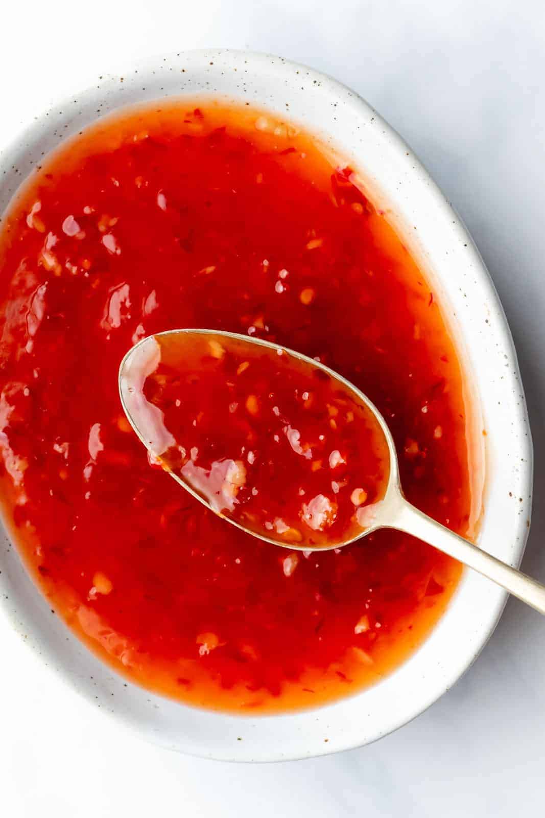
- 1/2 cup Banana Ketchup- Banana ketchup is a popular condiment in the Philippines. I made my own dipping sauce (Filipino Smash Sauce) with banana ketchup, mayo, yellow mustard, and some relish. But you can use sweet chili sauce or any other type of dipping sauce you prefer.
- 1/2 cup mayo3 tbsp relish- Never skip these two!

Equipment
- Large bowl or any deep mixing bowl
- Ziplock bag or piping bag
- Small brush
- Baking tray
- Deep pan for frying
- Tongs
- Optional: wooden spoon, instant cooking thermometer

Instructions
- Make the filling. Combine everything in a large mixing bowl. Mix well with a wooden spoon or your hands.
- Put the filling in a large ziplock bag or a piping bag.
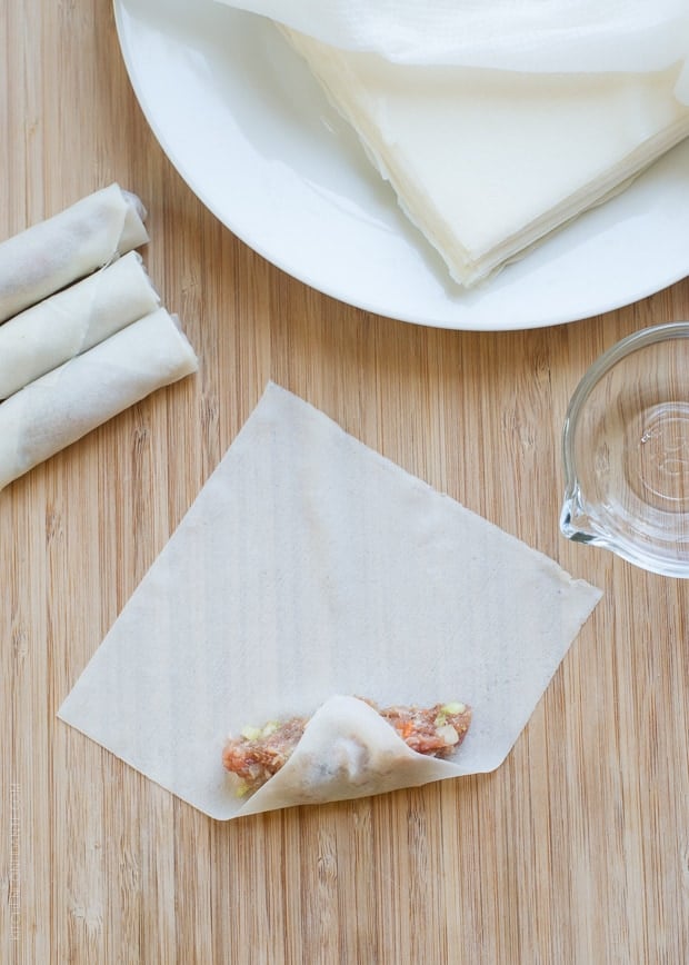
- Arrange your lumpia wrappers (or spring roll wrappers). Separate the wrappers, as it will make your wrapping easier and faster.
- Let’s wrap the lumpia. Cut a tiny hole in the bottom corner of your large zip-close bag. If using a piping bag, use a medium size tip. Place a line of the filling in the bottom of the wrapper. Roll and brush with egg white wash at the end to seal it.
- Repeat until you finish the filling.
- Place your lumpia on a baking tray. Freeze for a minimum of 1 hour before deep frying.
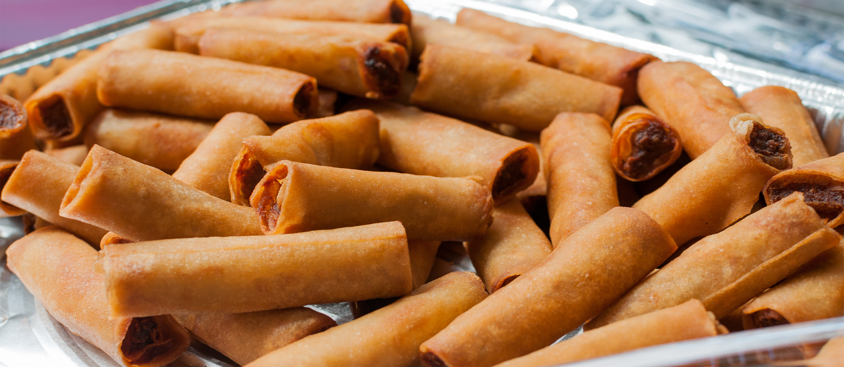
- Deep fry. Make sure you place the lumpia seal down first to keep it intact.
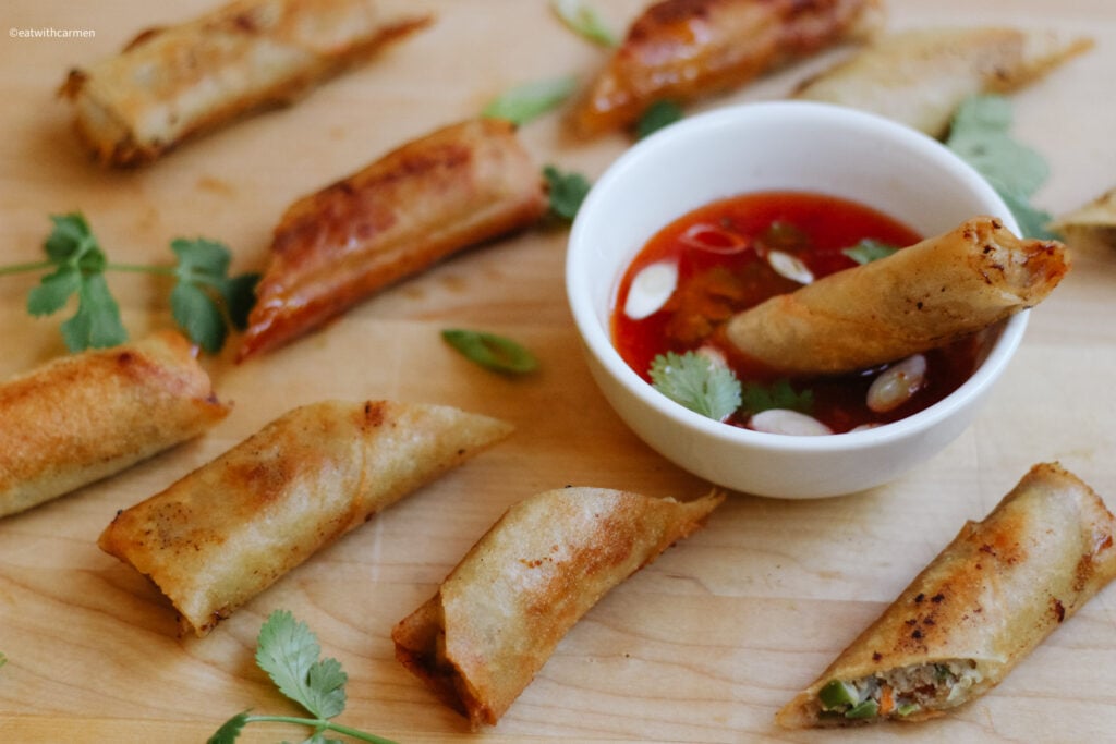
- Make your sauces. To keep it simple, sweet Thai chili sauce is a classic. But I'm sure you'll love my Filipino Smash Sauce.


Recipe Source: Eat with Carmen
Storage
- STORE the leftovers in an airtight container for up to 3 days in the fridge.
- REHEAT in an air fryer or oven to get the skin nice and crispy again.
- FREEZE the raw lumpia filling mixture in the freezer for up to two weeks, then deep fry!
External Research
Mom on Timeout
The bright / well-lit photography, all organized as thumbnail photos for each recipe in a grid-like pattern, makes this website easily browseable much like an explore page on Instagram or any other social media page. Categorization by type of food, as well as month posted, is a useful way to filter and possibly see how the same dish has evolved over time. I also appreciate the large photo at the start of each recipe as good visuals, which compliment the equally-detailed info box at the bottom with the ingredients list, cook time, and instructions in a neat container, although I would prefer this closer to the top, rather than having to scroll all the way to the footer.
Joshua Weissman
Each tile element is very responsive, changing color and with animation to encourage further engagement. 'Cuisine', 'Occasion', 'Meal', 'Type', and 'More' allow for an extreme level of filtering which keeps the user in control, providing suggestions for any situation. He also embeds his YouTube video, along with a large top banner image and a short personal blurb at the top, all serving as supplementary info without taking away from the actual recipe.
Our Best Bites
Yet again, tile elements are the star, although now they cover the entire home page in a varied way that layers titles, numbers, etc. in a smooth fashion. I would appreciate a bit of a break from the image overload, yet it's not overwhelming as the larger containers, subtle swaps in background color, and horizontal line separators serve to categorize the different sections well.
The Old Spaghetti Factory
I love the on-brand image containers, reinforcing the connection to trolleys and their origin of several locations by the waterfront. The food tab also has animated borders that appear as you scroll, which is good inspiration for incorporating some ornamental / cultural aspect to my sections (not only the images) without necessarily including tons of photography from the Philippines itself.
The Blakery
The toned down neutrals and bold border & button combos allow the cookies to shine. Considering the value & color contrast of my site, in a way that highlights the food where necessary, is key. The smaller image carousels on each cookie page have also inspired me to possibly display the several ingrediets, or cooking supplies, in a similar manner so as not to overload the horizontal space with side-by-side imagery.
Delfino Farms
Animations on these small elements, whether it's rotation, shift, or a nudge while hovering are all little touches I'd love to add to my recipe site. The seamless blend of full bleed images, with smaller inlays that have text on top is also something I'd like to consider to better integrate my type and image. Incorporating photography of gatherings and origins is another aspect I want to include as the cultural / geographic connection is super important to Filipino food.
